|

A panel layout defines the visual layout and presentation
of objects on a panel in the Guide tree. The Guide Design perspective
in Workbench includes default panel layouts. These default layouts
are designed to help you quickly create Guides with panels that
are structured in visually appealing and meaningful ways.
Using Flash Builder, you can create new panel layouts to structure
panel content in new ways. You can also include Flex objects that
take advantage of the capabilities of Flex.
Common panel layout components for GuidesIn general, a panel layout includes components that act
as placeholders for text, objects, or Guide extensions that you
specify in Workbench. Most panel layouts include common Guide placeholder
components:
- PanelItem:
- A placeholder object that displays an item, or a repeating
sequence of items, from the Guide tree. The item is either a field,
text object, or button.
- PanelText:
- Corresponds to the Guide Text object in the Guide Design perspective
in Workbench. Each PanelText object is contained within a PanelItem.
- PanelTitle:
- A placeholder object that displays the name of the current
panel. Specify the panel title in the Guide Design perspective in
Workbench.
- HelpPanel:
- Displays panel help text to a Guide filler. Specify the panel
help text in the Guide Design perspective in Workbench.
View full size graphic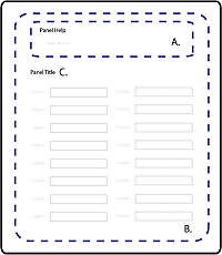 - A.
- Panel help text (HelpPanel) that you specify in the
Guide Design perspective in Workbench. Depending on the Guide layout,
the panel Help can appear as part of the panel. It can also appear with
the Guide Help text in the Help Center area of the Guide layout.
- B.
- Panel content that consists of Guide objects (PanelItem)
as well as Flex components.
- C.
- Panel title text (PanelTitle) that you specify in the
Guide Design perspective in Workbench.
Example of a panel layout for GuidesThe MXML source code for the panel layouts included with
Workbench are available in the Guides SDK code\src\ga\layouts folder.
The Guides SDK is located where Workbench is installed. By default,
the Guides SDK is located in C:\Program Files\LiveCycle\Workbench
10\sdk\misc\Guides.
For example, examine the MXML source for the One Column panel
layout:
<?xml version="1.0" encoding="utf-8"?>
<ga:LayoutTemplate width="100%" height="100%"
    xmlns:mx="http://www.adobe.com/2006/mxml"
    xmlns:s="library://ns.adobe.com/flex/spark"
    xmlns:ga="ga.model.*"
    xmlns:gc="ga.controls.*"    >

    <mx:Metadata>
        [IconFile("assets/GuideComponentDisabled.png")]
    </mx:Metadata>

    <mx:Script>
        <![CDATA[
            import mx.core.UIComponentDescriptor;
            import ga.controls.Wrapper;

            override public function get documentDescriptor(  ):UIComponentDescriptor { return Object(this)._documentDescriptor_; }
            override public function set documentDescriptor( oDescriptor:UIComponentDescriptor ):void { Object(this)._documentDescriptor_ = oDescriptor; }
        ]]>
    </mx:Script>

    <mx:VBox width="100%" height="100%" styleName="layoutobjects">
        <gc:HelpPanel id="helpPanel" styleName="panelhelp" />
        <ga:PanelItem  itemInstancesPerCycle="-1" repeatItemLimit="-1"  width="100%"/>
    </mx:VBox>

</ga:LayoutTemplate>
The MXML code is distributed into several sections:
Initial namespace definitions Namespaces are a
convenient way to define shortcuts to ActionScript packages to simplify
your code. To use Spark or MX components, you must include them
in the namespace definitions.
<mx:Metadata> An MXML metadata
block. For example, it can define an icon image to display in the
Components view of Flash Builder.
<mx:Script> The One Column
panel layout is an MXML component, and it is created declaratively
in MXML. Panel layouts created declaratively require this <mx:Script> block
to display form design objects.
<gc:HelpPanel> and <ga:PanelItem> Placeholder
components for the panel help and Guide objects respectively. Understanding
the PanelItem component is critical for creating
custom panel layouts.
The PanelItem class for Guide panel layoutsIn Workbench, the Guide Tree view in the Guide Design perspective
has panels where you add Guide objects. Each panel is like a type
of playlist. The objects on a panel are ordered in a sequence that
you determine, and each object occupies one space in the sequence.
The PanelItem class behaves like a column in
a table, where each object from the playlist occupies one slot,
or cell, in the table. You control how many cells you want the column
to display. When you include multiple instances of PanelItem,
you create a multicolumn experience with objects from the playlist distributed
across columns.
For an MXML example of the PanelItem class,
see Extend the blank panel layout for a Guide. However, understanding the concept
of the PanelItem class is central to understanding
panel layouts, and Guides as a whole.
For more examples of the PanelItem class, see
the MXML source for the panel layouts included in the Guides SDK
code\src\ga\layouts folder. By default, the Guides SDK is located
in C:\Program Files\LiveCycle\Workbench 10\sdk\misc\Guides.
Create panel layouts for GuidesCreate a blank panel layout for a GuideCreating a simple panel layout familiarizes you with the
basic concepts, including the structure and MXML definition of a
panel layout.
Important: Do not edit the panel layout files that
are included with Workbench. Instead, make uniquely named copies
of the content to help you get started creating panel layout extensions.
In Flash Builder, create a Flex library project and the
required folder structure.
See Flex library Projects for Guide (deprecated with LiveCycle ES3) extensions and Folder structure for Guide extensions.
Note: To display custom
panel layouts in the list of panel layouts, create all panel layouts
in the layouts folder of your Flex library project. After
you add the Flex library project in Workbench, the list of panel
layouts appears in the Guide Properties view.
Right-click the layouts folder, and then click New
> MXML Component.
Type a unique filename.
Workbench modifies the name
of your custom panel layout when it displays it. It adds a space
immediately before each uppercase character and number in the name
to make it easier to read. For example, an MXML component named MyPanel.mxml
appears as My Panel in Workbench.
From the Based On list, select LayoutTemplate.
(Optional) Set the values for Width and Height to 100%.
Click Finish.
The MXML source for your new panel layout looks like the following:
<?xml version="1.0" encoding="utf-8"?>
<model:LayoutTemplate xmlns:fx="http://ns.adobe.com/mxml/2009"
                    xmlns:s="library://ns.adobe.com/flex/spark"
                    xmlns:mx="library://ns.adobe.com/flex/mx"
                    xmlns:model="ga.model.*" width="100" height="100">
</model:LayoutTemplate>
This panel layout project compiles with no warnings or errors.
However, this panel layout in its current state does not display
any objects or content. You need to extend the blank panel layout
to display Guide objects and Flex components.
Extend the blank panel layout for a GuideAfter you create the shell for the new panel layout, add
Flex or Guide components in Flash Builder. However, panel layouts
are not required to contain any specific Guide components. For example,
you can create a panel that contains text objects, such as legal
text or instructions, which a user must read before filling the
Guide.
After you create a blank panel layout (see Create a blank panel layout for a Guide), you can extend it.
For example, extend the blank panel layout to mimic the functionality
of the One Column panel layout that is included in Workbench. Add
the following to the blank panel layout:
xmlns:gc="ga.controls.*"
Defines
the namespace for the HelpPanel class.
<mx:VBox width="100%" height="100%" styleName="layoutobjects" />
A
standard Flex component for organizing objects into a vertical list.
<gc:HelpPanel id="helpPanel" styleName="panelhelp" />
A
region of the panel layout for displaying panel help text. Set the id attribute to helpPanel,
and set the styleName attribute to the class name
for the corresponding panel help CSS style.
<ga:PanelItem itemInstancesPerCycle="-1" repeatItemLimit="-1" width="100%" />
By
default, an instance of PanelItem requires two
attributes:
The example defines PanelItem declaratively.
That is, it defines a PanelItem instance in MXML.
As a result, the <mx:Script> ActionScript
is required for Guide tree objects to correctly display:
    <mx:Script>
        <![CDATA[
            import mx.core.UIComponentDescriptor;
            import ga.controls.Wrapper;

            override public function get documentDescriptor( ):UIComponentDescriptor { return Object(this)._documentDescriptor_; }
            override public function set documentDescriptor( oDescriptor:UIComponentDescriptor ):void { Object(this)._documentDescriptor_ = oDescriptor; }
        ]]>
    </mx:Script>
Ensure that your MXML source looks like the following snippet:
<?xml version="1.0" encoding="utf-8"?>
<ga:LayoutTemplate xmlns:mx="http://www.adobe.com/2006/mxml"
    xmlns:ga="ga.model.*"
    xmlns:gc="ga.controls.*" >

    <mx:Script>
        <![CDATA[
            import mx.core.UIComponentDescriptor;
            import ga.controls.Wrapper;

            override public function get documentDescriptor( ):UIComponentDescriptor { return Object(this)._documentDescriptor_; }
            override public function set documentDescriptor( oDescriptor:UIComponentDescriptor ):void { Object(this)._documentDescriptor_ = oDescriptor; }
        ]]>
    </mx:Script>

    <mx:VBox width="100%" height="100%" styleName="layoutobjects">
        <gc:HelpPanel id="helpPanel" styleName="panelhelp" />
        <ga:PanelItem itemInstancesPerCycle="-1" repeatItemLimit="-1" width="100%" />
    </mx:VBox>

</ga:LayoutTemplate>
Ensure that the Flex library project builds with no warnings
or errors.
|
|
|


