|

A Guide layout defines
the visual layout and structure of a Guide that remains constant
throughout a data capture session. Workbench includes default Guide layouts.
The layouts are designed to help you quickly create Guides that
are structured in visually appealing and meaningful ways.
Use Flash Builder to create new Guide layouts to structure the
data capture experience to meet your specific needs. Guide layouts
are derived from the ga.controls.wrapper class
in the Guides ActionScript API.
For more information about the Guides ActionScript API, see ActionScript Language Reference.
Parts of the Guide layoutIn general, a Guide layout includes a number of components
that divide the rendered Guide into distinct areas:
Guide Help
Panel content
Navigators
Navigation controls
Toolbar
View full size graphic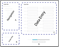 - A.
- The navigator panel allows Guide fillers to navigate
through the Guide, and follows the structure defined in the Guide
Tree view in Workbench.
- B.
- Guide Help text that you specify in the Guide Properties
view in Workbench.
- C.
- The content for each panel that you define in the Guide
Tree view and the editor in Workbench. Each data entry panel has
its own panel layout.
- D.
- Previous and Next buttons for navigating the Guide,
and a progress bar to indicate the percentage of required fields that
the Guide filler has completed.
Create a Guide layoutTo create a Guide layout, create a layout using MXML and
then reference the Flex library project in Workbench.
Creating a simple Guide layout is an easy way to get familiar
with basic concepts, including the structure and MXML definition
of a Guide layout.
Important: Avoid editing the Guide layout files that
are included with Workbench. Instead, make uniquely named copies
of the content to help you get started creating Guide layout extensions.
In Flash Builder, open your Flex project.
For
information about creating a Flex project, see Create Flex library projects for Guide extensions and Folder structure for Guide extensions.
Note: To display custom
Guide layouts in the list of Guide layouts, create all Guide layouts
in the wrappers folder in your Flex library project. After
you add the Flex library project in Workbench, the list of Guide
layouts appears in the Guide Properties view.
Right-click the wrappers folder, and then select New
> MXML Component.
Type a unique filename.
By default, Workbench adds
a space immediately before each capital letter in the name of your
component. For example, an MXML component named TabNav.mxml appears
as Tab Nav in Workbench.
In the Based On list, select Wrapper.
(Optional) Set values for Width and Height.
Click Finish.
The MXML source for your new Guide layout looks like the following:
<?xml version="1.0" encoding="utf-8"?>
<Wrapper xmlns="ga.controls.*"
        xmlns:mx="http://www.adobe.com/2006/mxml" >
        xmlns:s="library://ns.adobe.com/flex/spark"

</Wrapper>
Updating the MXML source, the Guide layout source looks like
the following:
<?xml version="1.0" encoding="utf-8"?>
<gc:Wrapper xmlns:mx="http://www.adobe.com/2006/mxml"
            xmlns:s="library://ns.adobe.com/flex/spark"
            xmlns:gc="ga.controls.*" >

</gc:Wrapper>
Add content to your Guide layoutAfter you create the shell of the new Guide layout, add
Flash Builder components using the Flash Builder Source view. Use
the components that provide the behavior you are trying to achieve.
You can also include other Guide and Flex components to suit your
needs.
For example, extend the Guide layout to include an area for displaying
Guide content. You can also include some navigation buttons to move
between panels and to submit the Guide data.
Add the following components to the Guide layout:
A standard Flex component for organizing objects into
a vertical list. The padding settings provide a margin around the
Guide content:
<mx:VBox width="100%" height="100%">
        paddingTop="5" paddingBottom="5" paddingLeft="5" paddingRight="5">
Note: Alternatively,
create margins using the setting and value styleName="guide".
This method derives the margins from the CSS values.
The region of the Guide layout for displaying the current
data entry panel and the associated layout:
<gc:PanelContent width="100%" height="100%" />
A standard Flex component for organizing objects into a horizontal
list:
<mx:HBox>
A button object that goes to the previous panel in the Guide.
This object is inactive if the current panel is the first panel
in the Guide. The label attribute controls the
button caption text:
<gc:PreviousPanelButton id="previous" label="{'Back'}"/>
Note: The
curly brackets and single quotation mark that enclose the button
text prevent the component from using resource strings. This text
is applied after the component is initialized.
A button object that goes to the next panel in the Guide.
This object is inactive if the current panel is the last panel in
the Guide:
<gc:NextPanelButton id="next" label="{'Forward'}"/>
A button object that submits the Guide data. This object
is inactive if the current panel is not the last panel in the Guide:
<gc:SubmitButton label="{'Submit Data'}"/>
Note: Specifying a value for the label attribute overwrites the default SubmitButton labels. The default SubmitButton labels are added based on the submission option selected in Workbench.
The
SubmitButton component behaves differently depending on the submission
options the Guide author sets for the Guide in Workbench:
Submit option
|
SubmitButton behavior
|
Default SubmitButton label
|
|---|
Guide (Default)
|
Guide fillers click the submit button on
the Guide to submit the data.
|
Submit
|
Interactive PDF
|
Clicking the submit button opens the interactive
PDF form. The Guide filler clicks the submit button in the interactive
PDF form to submit the data.
This option is available when
the Guide is based on an XDP form that includes an interactive PDF
form. When you select this option, a Submit From PDF button appears
in the navigation button area. Clicking this button switches the
view to the interactive PDF document, which must include a Submit
button. The Submit From PDF button appears in all environments where
the Guide runs, such as Workspace or a browser. No other submit
button appears in the navigation button area of the Guide or in
the Workspace chrome.
|
Submit from PDF
|
User Button
|
Submits the data from a button that you
add to a panel in the Guide. This submit button appears in all environments where
the Guide runs. No other submit button appears in the navigation
button area of the Guide or in the Workspace chrome.
|
N/A
|
Host
|
The SubmitButton component does not appear
on the Guide. The hosted application, such as Workspace, must extract
the data from the Guide and perform the data submission.
|
N/A
|
Your MXML source looks like the following snippet:
<?xml version="1.0" encoding="utf-8"?>
<gc:Wrapper width="100%" height="100%"
    xmlns:mx="http://www.adobe.com/2006/mxml"
    xmlns:gc="ga.controls.*" >

    <mx:VBox width="100%" height="100%">
            paddingTop="5" paddingBottom="5" paddingLeft="5" paddingRight="5">
        <gc:PanelContent width="100%" height="100%" />
        <mx:HBox>
            <gc:PreviousPanelButton id="previous" label="{'Back'}"/>
            <gc:NextPanelButton id="next" label="{'Forward'}"/>
            <gc:SubmitButton id="submit" label="{'Submit Data'}"/>
        </mx:HBox>
    </mx:VBox>
</gc:Wrapper>
Ensure the Flex library project builds with no warnings or errors.
Button Bar Guide layoutTo better understand how to structure Guide layouts, use
the Button Bar Guide layout as an example. The Button Bar Guide
is included in the Guides SDK code\src\ga\wrappers folder. The Guides
SDK is located where Workbench is installed, by default C:\Program
Files\Adobe LiveCycle ES3\Workbench 10\sdk\misc\Guides.
In addition to the structure, the Button Bar Guide layout contains
custom ActionScript variables. These variables define the physical
location of the regions of the Guide for easy referencing:
TOOLBAR_TAB:int (the default value is
100)
HELP_CENTER_TAB:int (the default value is
200)
BUTTONS_TAB:int (the default value is 9000)
The Button Bar Guide layout also includes custom ActionScript
functions:
createChildren():void
Adds a new
PAGE_SELECTION_CHANGE Guide event listener to the Guide layout.
pageChange(event:GAEvent):void
Dispatched
when a Guide filler navigates to the next section of the Guide.
The Button Bar Guide layout uses a navigation control that segments
the Guide according to the sections you define in the Guide Tree
view in Workbench.
Binding a Guide layout to a data modelGuide layouts can access items from a bound data model.
For example, you could read a numerical value from a data model
that acts as a record number. The record number appears in the upper-right
corner of the Guide layout throughout the duration of the data capture
session. Besides merely displaying data values that you get from
the data model, you can also execute business logic based on those
values. This logic can alter the intent of your business process.
Create a set functionSet up a function that references whenever the underlying
data model item changes. The function uses the binding value of
the data model item to obtain the value of the item. For example,
the following MXML demonstrates a reference to the value of a data
model item, empName, that stores an employee name:
<?xml version="1.0" encoding="utf-8"?>
<gc:Wrapper width="100%" height="100%"
    xmlns:mx="http://www.adobe.com/2006/mxml"
    xmlns:gc="ga.controls.*" >

    <mx:Script>
        <![CDATA[

            Wrapper.instance.bindSetter("Services.employee.empName", empNameSetter);

            private function empNameSetter( value:Object ):void
            {
                var empName:String = value as String;  // cast to appropriate type
                If ( empName == "Tony Blue" ) {
                    // do something here
                }
            }
        ]]>
    </mx:Script>

    <mx:VBox width="100%" height="100%">
        <gc:PanelContent width="100%" height="100%" />
        <mx:HBox>
            <gc:PreviousPanelButton label="Back" />
            <gc:NextPanelButton label="Forward" />
            <gc:SubmitButton label="Submit Data" />
        </mx:HBox>
    </mx:VBox>
</gc:Wrapper>
Each time the Services.employee.empName data
item changes value, the named function executes with the value of
the item. For example, you could save the value locally and have
MXML controls use that local variable as their {data provider}.
|
|
|
