|

You can transform a Button component horizontally and vertically
while authoring and at run time. While authoring, select the component
on the Stage and use the Free Transform tool or any of the Modify >
Transform commands. At run time, use the
setSize()
method
or any applicable properties of the Button class, such as
height
and
width
,
and
scaleX
and
scaleY
.
Resizing the button does not change the size of the icon or label.
The bounding box of a Button corresponds to the Button’s border
and also designates the hit area for the instance. If you increase
the size of the instance, you also increase the size of the hit
area. If the bounding box is too small to fit the label, the label
is clipped to fit.
If the Button has an icon and it is larger than the Button, the
icon extends beyond the Button’s borders.
Use styles with the Button component
A Button’s styles generally specify values for a Button’s
skins, icons, text formatting, and padding when the component is
drawn in its various states.
The following procedure puts
two Buttons on the Stage and sets the
emphasized
property
to
true
for both Buttons when the user clicks one
of them. It also sets the
emphasizedSkin
style
for the second Button to the
selectedOverSkin
style
when the user clicks it so the two Buttons show different skins
for the same state.
-
Create a Flash file (ActionScript 3.0).
-
Drag two Buttons to the Stage, one at a time, and give them
instance names of
aBtn
and
bBtn
. In the Parameters
tab of the Property inspector, give them labels of Button A and
Button B.
-
Add the following code to the Actions panel on Frame 1 of
the Timeline:
bBtn.emphasized = true;
aBtn.emphasized = true;
bBtn.addEventListener(MouseEvent.CLICK, Btn_handler);
function Btn_handler(evt:MouseEvent):void {
    bBtn.setStyle("emphasizedSkin", "Button_selectedOverSkin");
}
-
Select Control > Test Movie.
-
Click one of the buttons to see the effect of the
emphasizedSkin
style
on each button.
Use skins with the Button component
The Button component uses
the following skins that correspond to its different states. To
edit one or more skins to change the Button’s appearance, double-click the
Button instance on the Stage to open a palette of its skins, as
shown in the following illustration:
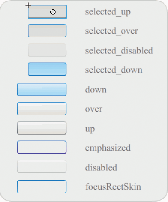
Button skins
If a button is enabled, it displays its over state when the pointer
moves over it. The button receives input focus and displays its
down state when it’s pressed. The button returns to its over state
when the mouse is released. If the pointer moves off the button
while the mouse is pressed, the button returns to its original state. If
the toggle parameter is set to
true
, the pressed
state is shown with the selectedDownSkin, the up state with the
selectedUpSkin, and the over state with the selectedOverSkin.
If a Button is disabled, it displays its disabled state, regardless
of user interaction.
To edit one of the skins, double-click it to open it in symbol-editing
mode, as shown in the following illustration:

Button in symbol-editing mode
At this point you can use the Flash authoring tools to edit the
skin to your liking.
The following procedure changes the color of the Button’s selected_over
skin.
-
Create new Flash file (ActionScript 3.0).
-
Drag a Button from the Components panel to the Stage. In
the Parameters tab, set the toggle parameter to
true
.
-
Double-click the Button to open the palette of its skins.
-
Double-click the selected_over skin to open it in symbol-editing
mode.
-
Set the zoom control to 400% to enlarge the icon for editing.
-
Double-click the background until its color appears in the
Fill color picker in the Property inspector.
-
Select color #CC0099 in the Fill color picker to apply it
to the background of the selected_over skin.
-
Click the Back button at the left side of the edit bar above
the Stage to return to document-editing mode.
-
Select Control > Test Movie.
-
Click the button to put it in the selected state.
When
you move the mouse pointer over the Button, the selected_over state should
appear as it does in the following illustration.

Button showing selected_over skin with modified color
|
|
|


