|

Guides are an alternative method for collecting
data from users, based on Adobe® Flash® technology, that steps users through the
data entry experience. Each Guide is a collection of layouts,
sections, panels, and controls that together provide an interface
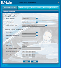
for users to view and fill. For example, a Guide can be used to
collect information for an accident claim.
Along with the Guide, you can choose to provide a read-only or
interactive PDF document rendition of the Guide. The read-only document
often provides the contract or document of record of the transaction,
which is useful for saving locally, printing, and archiving.
Guides provide various ways to customize and present information
to Guide fillers. For example, Guides can be structured to group
required data into logical clusters called sections. You
select a Guide layout that defines the presentation of sections
and dictates how Guide fillers navigate between sections.
Each section includes one or more panels. Panels contain fields
and navigation controls, such as Previous or Next buttons. The Guide
then steps Guide fillers through data entry by panel. In each panel,
the Guide can display Help text or video to assist Guide fillers
with filling the fields in that panel. You can also set conditions
and rules to control the display of optional panel based on user-entered
data.
When the Guide is completed, Guide fillers submit the data, according
to the submission method defined by the Guide.
Requirements for GuidesGuides are rendered by a LiveCycle Server and have specific
server-side dependencies. To render a Guide, the following modules
are required:
All Guides require Adobe LiveCycle ES3 - Foundation.
Some Guides that are based on an XDP or PDF form require
Adobe LiveCycle ES3 - Forms 10.
Guides that include a read-only document of record require
Adobe LiveCycle ES3 - Output 10.
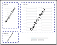
Guide conceptsAt runtime, a Guide consists of a Guide layout,
panels, and navigation controls:
- Guide layout:
- The Guide wrapper that specifies the navigation method and
the position of each part within the container. It contains the
navigation, data entry, and Guide Help panels, and the navigation
controls. In Workbench, specify the Guide layout in the Guide Properties
view.
- navigation panel:
- Contains the Guide hierarchy that lists the sections and
data entry panels in the Guide. Use the hierarchy to organize the
Guide content into logical, related groups of fields and text. The
Guide layout determines the location of the navigation panel within
the Guide container. In Workbench, add and organize the sections
and panels in the Guide Tree view.
- data entry panel:
- Displays the model items, Guide controls, text, and Help
for the selected panel. The Guide layout determines the location
of the data entry panels within the Guide container. A Guide includes
one or more data entry panels, but only one data entry panel is
visible at a time. You can select an appropriate layout for each
panel. The data entry panel is the only type of panel that you can
select a layout for. In Workbench, design the panels in the editor.
- Guide Help panel:
- Displays the Help for the Guide, if Help is available. The Guide
layout determines the location of the Guide Help panel within the
Guide container. In Workbench, specify the Guide Help in the Guide
Properties view for the Guide.
- Navigation controls:
- Can include navigation buttons. Navigation controls are automatically
generated for each Guide layout at runtime.
The following example shows the parts of a Guide in a Guide layout.
Guide Design perspective in WorkbenchThe Guide Design perspective consists of an editor and
several views. Open the Guide Design perspective to create or edit
Guides. The editor is a visual component that is used to edit or
browse a Guide. The views support the editor. Use the views to interact
with the model, structure your Guide, and navigate the information
in Workbench.
Use one of these ways to open the Guide Design perspective:
Click the Guide Design Perspective icon in the toolbar.
Select Window > Open Perspective > Guide Design.
Select Window > Open Perspective > Other > and then
select Guide Design, and click OK.
By default, perspectives always open in the same window. To open
perspectives in a new window, edit the preferences.
Switch between perspectivesIn Workbench,
you can edit the preferences to automatically switch between the Data
Model perspective and the Guide Design perspective.
Select Window > Preferences.
On the Preferences dialog box, select Adobe LiveCycle ES3
- Workbench > Preferences.
Select the Automatically Open Associated Perspectives When
Editing Assets option.
Guide Design perspective viewsThe Guide Design perspective, by default, displays all
views that are relevant to a user who is creating a Guide. You can
modify which views are displayed, and the arrangement of views in
the workspace, to suit your needs.
The Guide Design perspective uses the following views:
Editor
Guide Tree
Data Model
Guide Properties
Problems
Open a view Select Window > Show View > view,
where view is the name of the specific view you want to display. Select Window > Show View > view,
where view is the name of the specific view you want to display.
After
you open a view, it becomes part of the current perspective until
you close the view.
EditorThe editor acts as both an interactive canvas for creating
your Guide and a design-time preview of individual panels within
your Guide. The editor includes a Preview button, so that you can
preview your Guide in a browser while you work.
When you select an item in the editor, the selection is reflected
in the Guide Tree view.
You can also drag objects from the Data Model view directly onto
a specific panel in the editor.
Guide TreeThe Guide Tree is a structured representation of the Guide,
which displays the organization of sections, panels, and objects.
The Guide Tree also displays all errors and warnings for the
items in the Guide.
An icon appears on each node and parent node that contains a
problem. When you hover on a node, a message lists all the problems
for the node. When you hover on a parent node, the message indicates
that one or more child nodes has a problem.
Data ModelThe Data Model view is a structured representation of the
data model that the Guide is based on.
The data model can be created using the Adobe application modeling
language (FML) in the Data Model perspective in Workbench. The data
model can also be an XDP or PDF form created in Designer.
The Data Model view displays the entities and properties contained
within a data model. It also displays additional items that you
add for use in the current Guide.
Changes made in the Data Model view apply only to the current
Guide, and are not saved in the original model. To change the model,
edit the model source file. For example, edit the FML file in the
Data Model perspective, or edit the XDP file in Designer.
The Data Model view also displays all errors and warnings for
the items in the model. An icon appears on each node and parent
node that contains a problem. When you hover on a node, a message
lists all the problems for the node. When you hover on a parent
node, the message indicates that one or more child nodes has a problem.
To create your Guide, drag items from the Data Model view into
the editor and the Guide Tree view.
Guide PropertiesThe Guide Properties view includes options for configuring
the panels and items within a Guide, and for configuring the Guide
as a whole.
ProblemsThe Problems view displays all the errors and warnings
for a Guide, including mobile compatibility issues.
|
|
|
