|

The palettes
provide easy access to the tools without cluttering your workspace. Palettes
can include one or more tabs, each containing common properties.
For example, the Object palette can include one or more tabs.
You can arrange the palettes in the workspace to suit your work
style. For example, you can hide the rarely used palettes and move
the frequently used ones into one palette window.
As you work in the Layout Editor, the information that appears
in certain palettes changes to reflect the selected object. For
example, if you select an object, the information in the Layout
palette changes to display information about the object’s size and
position.
Hierarchy paletteThe Hierarchy palette is a graphical representation
of the contents in the Design View and Master Pages tabs.
Whatever you select in the Hierarchy palette is also selected
in the body or master page that it is associated with. See Hierarchy palette menu.
Data View paletteIf a data connection exists,
the Data View palette displays the hierarchy derived from the data
connection. The top nodes in the hierarchy represent each data connection
and display the name of the data connection. A data connection provides
a link between the form and the data source.
When you design a form based on a data connection, Designer builds
a data structure for your form based on that data source. You can
filter the nodes to work with and quickly create a form using some
or all of the data source. You then use binding to link a node from
a data source to an object on the form. See Connecting to a data source.
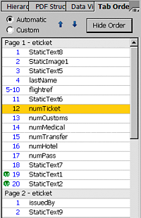
Tab Order paletteThe Tab Order palette displays a numbered
list of all the objects on the form, where each number represents
the position of the object within the tabbing order.
The
Tab Order palette may show the following visual markers in the list:
A gray bar marks each page of the form. The tabbing order
on each page starts with the number 1.
The letter M inside a green circle indicates master
page objects (visible only when viewing the form on the Design View
tab).
A range of numbers indicates objects within a fragment reference.
A yellow background indicates the currently selected object.
A lock icon beside the first object on the page indicates
that the object cannot be moved within the order (visible only when
viewing the form on the Master Pages tab).
For
more information see Using the Tab Order palette.
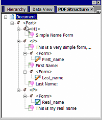
PDF Structure paletteThe
PDF Structure palette displays a view of the hierarchical structure
of tagged PDF documents, which provide accessibility and a defined
tabbing and reading order for assistive technologies, such as keyboard
access and screen readers. See the PDF Structure palette menu.
For information about PDF documents
as artwork, see Importing PDF documents as artwork.
Object Library paletteThe Object Library palette contains
all the objects that you can add to a form design. Objects are organized
into categories:
- Standard
- Contains the most commonly used form objects, such as check
boxes and text fields.
- Barcodes
- Contains a list of barcode objects.
- Custom
- Contains preformatted objects, such as address blocks and
phone number fields.
For information about using the library palettes, see Managing library palettes.
Fragment Library paletteThe Fragment Library palette
contains the fragment libraries that are currently open. A fragment
library corresponds to a folder in your file system that contains the
fragment source XDP files.
Each fragment library has an expandable panel in the library
that lists the available fragments.
- My Fragments
- A location for the fragments that you create. You can insert
them in a form design or use them to create new fragments.
Style Catalog paletteUse the Style Catalog palette to manage styles sheets,
and to edit and apply styles to objects in a form design. The Style
Catalog palette lists the various style sheets available with a
form and the styles included with each style sheet. The Style Catalog
includes a different panel for each style sheet. Each panel lists
the styles included with that style sheet. The first panel is the
Internal Style Sheet panel. Below the internal style sheet panel
are panels for each Designer Style Sheet file (XFS) file that you
add to the Style Catalog. See Styles .
Layout paletteUse the Layout palette to set the
following properties for the selected object::
Size and position of the object.
Whether the object should ignore the defined height and width,
and expand to reveal all of its content.
Position of the anchor (insertion) point. You can rotate
an object around its anchor point in a 90°, 180°, or 270° increment.
Align selected objects in subforms that flow content.
Margins around the object.
Caption position and width. You can also hide the caption.
For more information, see Formatting objects.
When you select an object, the Layout palette automatically displays
the selected object’s settings. You can edit most of an object’s
layout settings directly in the Layout Editor. For example, to change
an object’s position, you can drag it to the new location on the
page.
Border paletteUse the Border palette to edit the
border properties for objects in the form design. You can edit the
borders individually (left, right, top, and bottom) or together.
You can also specify the type of border corner and background color.
For more informaiton, see Border properties in the Border palette.
Object paletteUse the Object palette to modify properties
that are specific to the selected object. The object that is selected
in the Layout Editor determines which tabs are available in this
palette.
Accessibility paletteUse the Accessibility palette to specify
custom text for an object that a Microsoft® Active
Accessibility (MSAA)- compliant screen reader reads as it passes
through the form. (See Making objects accessible.) If custom screen reader text is available
for the object, the screen reader will read the custom text and
not the tool tip.
You can also change the default order in which the screen reader
searches for text to read on an object-by-object basis, and you
can turn off screen reader text for any object.
For more informaiton, see Accessibility properties in the Accessibility palette.
Font paletteUse the Font palette to change the
font family, size, style, and scale, as well as the baseline shift,
letter spacing, and kerning of the text in one or more selected objects.
You can change the font properties of text in text objects, in the
caption area of objects such as text fields, decimal fields, and
numeric fields, and in the value area of text field objects.
For more information, see Formatting text.
Paragraph paletteUse the Paragraph palette to change
the alignment, indentation, line spacing, and hyphenation of the
selected text. You can also set the radix alignment for a Numeric
Field object. The options that appear in the Paragraph palette depend
on what is selected.
For more information, see Formatting paragraphs.
Use the Paragraph palette to create
lists and to change the alignment, indentation, line spacing, and
hyphenation of the selected text. You can also set the radix alignment
for a Numeric Field object. The options that appear in the Paragraph
palette depend on what is selected.
Drawing Aids paletteUse the Drawing Aids palette to specify
the grid and ruler settings and drawing units. You can also show
or hide object boundaries and specify boundary border style. The
settings for snapping objects to other elements on the page and guideline
definitions are also included on the Drawing Aids palette.
The horizontal and vertical rulers, the grid, and the long cross
hairs help you position objects precisely across the width or length
of a page. When visible, rulers appear along the top and left side
of the active body or master page. Markers in the ruler display
the pointer’s position when you move it. Changing the ruler origin
(the (0, 0) mark on the top and left rulers) lets you measure from a
specific point on the form design.
You can also show or hide object boundaries on the form design.
Showing boundaries is useful for displaying objects that do not
have borders on the form. You can also specify border style for
fields, subforms, content areas, groups, and other objects.
When you move objects, the snapping options enable you to automatically position
them in relation to other elements on the page. Objects can snap
to the grid, a guideline, another object, or the center of the page.
You can use guidelines as a visual cue or as elements for object
snapping. Use the guideline definitions lists to add or remove horizontal
or vertical guidelines.
For more information, see To use the drawing aids.
Info paletteThe Info
palette displays the metadata associated with the selected objects.
This metadata is stored in the XML source as named children of a <desc> element.
You can edit some metadata for the form design by using the Form
Properties dialog box (Info tab).
Report paletteThe Report palette provides information
about the form design. The Warnings tab lists errors that are reported
as you work in the form design, the Binding tab lists fields based
on how you defined their binding data, and the Log tab shows a log
of actions reported by Designer.
To clear the Warnings tab, you must address the errors listed.
To clear the Log tab, click the palette menu and select Clear Warnings.
See Addressing warning messages in the Report palette.
How To paletteThe How To palette contains a list
of help topics about common procedures in Designer. You can scroll
the list to locate a topic of interest and click More Info to see
the steps.
|
|
|
