Know the types of toolbars, toolbar icons, preferences and customization of toolbars in Adobe FrameMaker.
Introduction
You can access all commonly used commands from the following toolbars for use in structured or unstructured documents. You can display a toolbar from the menu.
- Graphics Toolbar
Provides shortcuts for graphics creation and edits.
- Quick Access Bar
Provides commands for opening and saving documents, editing text, graphics, and tables.
- Structured Access Bar
Provides commands for working with the structured document, such as add an XML document, open element catalog, edit attributes, and more.
- Text Formatting
Provides text formatting commands, such as font styles.
- Table Formatting
Provides table editing commands, such as add rows, columns, merge cells, and text alignment options for table cells.
- Paragraph Formatting
Provides commands for formatting paragraphs, such as tab stops, text alignment, spacing, as well as the paragraph style list.
- Quick Element
Provides commands inserting and wrapping common structured document elements.
- Object Alignment
Provides commands to change sequence, alignment, and orientation of objects.
- Object Properties
Provides commands to group objects, change layer order, reshape, scale, and snap objects.
- Track Text Edits
Provides commands for tracking, accepting, and rejecting text edits.
- Direction Toolbar
Provides commands for working with bi-directional documents.
You also have keyboard shortcuts for all commands accessible through the toolbars and menus.
Toolbar icons
FrameMaker gives you a predefined set of grayscale and colored icons. These icons resize according to the resolution of your display device. By default, FrameMaker uses grayscale icons. You can switch to colored icons by changing the Icons setting in the Preferences dialog.
Set toolbar icon preferences
Set your toolbar icon preferences to choose colored or greayscale icons:
Choose .
In the Preferences dialog, select Interface and choose the preferences for Icons – Grayscale or Colored.
Restart FrameMaker for the icon preferences to take effect.
Customize toolbar icons
You can also add your own custom icons in FrameMaker. You need to update the toolbar’s .xml file which is available at two location – in FrameMaker install location, and in %appdata% folder. If you want to permanently save your custom toolbar, you must update the toolbar file located within the FrameMaker’s install location. Otherwise, you can also update the toolbar files available within the %appdata% folder.
For example, if you want to update the Quick Element toolbar in WYSIWYG View, then you can update the quick_element.xml file located within the following location:
<Fm_install_location>\fminit\WorkSpaces\Structured\WYSIWYGView\toolbars
The preferred method is, to update the toolbar files in the user preference folder (%appdata%):
C:\Users\<username>\AppData\Roaming\Adobe\FrameMaker\<version>\WorkSpaces\Structured\WYSIWYGView\toolbars
Similarly,
you have to specify the base path of your icon image directory in
the maker.ini file. Within the maker.ini file,
use the ToolbarCustomImageDir property to specify
the base path of your icon directory. Again, the maker.ini file
is available within the FrameMaker install location and your %appdata% folder.
If you specify the base path at both locations, then FrameMaker
gives precedence to the location specified in the %appdata%\Adobe\FrameMaker\<version>\maker.ini file.
Perform the following steps to customize toolbar icons in FrameMaker:
Create and store all the icon files on your system. You can store icons at any location including the %appdata% folder.
Specify the base path of the icon directory in the
ToolbarCustomImageDirproperty in the maker.ini file. For example, if your icons are stored in the following folder structure:Figure 1. Sample folder structure to store custom icons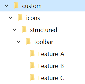
Then, you need to specify the base path as C:\custom\icons\structured\toolbar.
Locate the .xml file of the toolbar relevant to your view and mode and open it for editing.
Locate the
<ACTION>element relevant to the icon you want to customize. A sample of the<ACTION>element code is given below:<ACTION command="CenterPara"> <images base="Feature-B/P_TextAlignCenter_Md"/>Add the base name of the icon in the
@baseattribute of images element.Note: In our example the icons are located within the sub-directories, therefore we have to specify the relative path.Create at least six icon images for different monitor zoom levels. The supported zoom levels are 100%, 150%, and 200%. For each zoom level, you need to have two images—one for enabled mode and other for disabled mode.
The following table lists the icons names and dimensions for using custom grayscale icons. For example, if your icon’s base name is xyz, then you can have six image files for the following possible combinations of zoom levels:
Zoom level
Icon names
Recommended icons size in pixels
Enabled
Disabled
100%
xyz.png
xyz_D.png
18×18
150%
xyz_3TO2X.png
xyz_D_3TO2X.png
27×27
200%
xyz_2X.png
xyz_D_2X.png
36×36
Note that for disabled icons,
_Dmust be specified in the filename as shown the above table. Similarly, for 150% zoom level,_3TO2Xis specified in the filename and_2Xis specified for icons to be used at 200% zoom level.If you want to use colored icons, then name the files using the following syntax:
<base-name>_C_<zoom-level>.png
The above-mentioned syntax is for the Enabled icons. To create Disabled icons, then use the following file-naming syntax:
<base-name>_C_D_<zoom-level>.png