|

You can transform a TextArea
component horizontally and vertically while authoring and at run
time. While authoring, select the component on the Stage and use
the Free Transform tool or any of the Modify > Transform
commands. At run time, use the
setSize()
method
or any applicable properties, such as
height
,
width
,
scaleX
and
scaleY
of
the TextArea class.
When a TextArea component is resized, the border is resized to
the new bounding box. Scroll bars are placed on the bottom and right
edges if they are required. The text area is then resized within
the remaining area; there are no fixed-size elements in a TextArea
component. If the width of the TextArea component is too narrow
to display the size of the text, the text is clipped.
Styles and the TextArea component
The TextArea component’s
styles specify values for its skins, padding, and text format when
the component is drawn. The
texFormat
and
disabledTextFormat
styles
govern the style of the text that the TextArea displays. For more
information about skin style properties, see
Use skins with the TextArea component
.
The following example sets the
disabledTextFormat
style
to change the appearance of text when the TextArea is disabled but
the same process applies to setting the
textFormat
style
for an enabled TextArea.
-
Create a new Flash file.
-
Drag a TextArea component to the Stage and give it an instance
name of
myTa
.
-
Add the following code to the Actions panel on Frame 1 of
the main Timeline.
var tf:TextFormat = new TextFormat();
tf.color = 0xCC99FF;
tf.font = "Arial Narrow";
tf.size = 24;
myTa.setStyle("disabledTextFormat", tf);
myTa.text = "Hello World";
myTa.setSize(120, 50);
myTa.move(200, 50);
myTa.enabled = false;
-
Select Control > Test Movie.
Use skins with the TextArea component
The TextArea component uses
the following skins, which you can edit to change its appearance.

TextArea skins
Note:
Changing the ScrollBar skin in one component
will change it for all other components that use the ScrollBar.
The following procedure changes the border colors of the Focus
Rect Skin, which appears when the TextArea has focus, and the Normal
skin.
-
Create a new Flash file.
-
Drag a TextArea component to the stage and double-click it
to open its panel of skin icons.
-
Double-click the Focus Rect Skin.
-
Click the border of the Focus Rect Skin to select it. When
it’s selected its current color appears in the Fill color picker
in the Property inspector.
-
Click the Fill color picker in the Property inspector to
open it and select color #CC0000 to apply it to the border.
-
Click the Back button at the left side of the edit bar above
the Stage to return to document-editing mode.
-
Double-click the TextArea component to open its panel of
skin icons.
-
Double-click the Normal skin.
-
Select each edge of the Normal skin’s border, one at a time,
and set its color to #990099.
-
Click the Back button at the left side of the edit bar above
the Stage to return to document-editing mode.
-
Select Control > Test Movie.
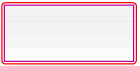
When you select
the TextArea to begin entering text, its border should appear as
shown in the following illustration:
The outer border
is the Focus Rect skin and the inner border is the border of the
Normal skin.
For information about editing the UIScrollBar
skin see
Customize the UIScrollBar component
.
|
|
|
