|

You
can transform a ProgressBar component horizontally and vertically
while authoring and at run time. While authoring, select the component
on the Stage and use the Free Transform tool or any of the Modify >
Transform commands. At run time, use the
setSize()
method
or the appropriate properties of the ProgressBar class such as
height
,
width
,
scaleX
,
and
scaleY
.
The ProgressBar has three skins: a track skin, a bar skin, and
an indeterminate skin. It uses 9-slice scaling to scale the assets.
Styles and the ProgressBar component
You can set style properties
to change the appearance of a ProgressBar instance. The ProgressBar’s
styles specify values for its skin and padding when the component
is drawn. The following example enlarges the size of a ProgressBar instance
and sets its barPadding style.
-
Create a new FLA file.
-
Drag the ProgressBar component from the Components panel
to the Stage and give it an instance name of
myPb.
-
On Frame 1 of the main Timeline, enter the following code
in the Actions Panel:
myPb.width = 300;
myPb.height = 30;

myPb.setStyle("barPadding", 3);
-
Select Control > Test Movie.
For information
on setting skin styles, see
About Skins
.
Skins and the ProgressBar component
The ProgressBar component
uses skins to represent the progress bar track, the completed bar,
and an indeterminate bar as shown in the following illustration.

ProgressBar skins
The bar is placed over the track skin, using the barPadding to
determine the positioning. The assets are scaled using 9-slice scaling.
The indeterminate bar is used when the ProgressBar instance’s
indeterminate
property
is set to
true
. The skin is resized vertically
and horizontally to fit the size of the ProgressBar.
You can edit these skins to change the appearance of the ProgressBar.
For example, the following example changes the color of the indeterminate
bar.
-
Create a new FLA file.
-
Drag a ProgressBar component to the stage and double-click
it to open its panel of skin icons.
-
Double-click the indeterminate bar skin.
-
Set the zoom control to 400% to enlarge the icon for editing.
-
Double-click one of the diagonal bars, then hold down the
Shift key and click on each of the others. The current color appears
in the Fill color picker in the Property inspector.
-
Click the Fill color picker in the Property inspector to
open it and select color #00CC00 to apply it to the selected diagonal
bars.
-
Click the Back button at the left side of the edit bar above
the Stage to return to document-editing mode.
-
Select Control > Test Movie.
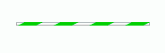
The ProgressBar
should appear as shown in the following illustration.
|
|
|
